Photos in Guest Apps
Overview
The photos guests see in the guest apps (Go facility page, Booking, Check-in, Member) come from four places in the admin console. One photo can appear in several apps. This page is organised by guest app: for each place a photo appears, it tells you where in the admin console to change it.
For example, the large hero banner at the top of the Go facility page is the "Cover image". Go has no setting of its own: add a cover image under Basic Settings and it appears in Go, Check-in and Member at the same time.
Where to add photos (4 places)
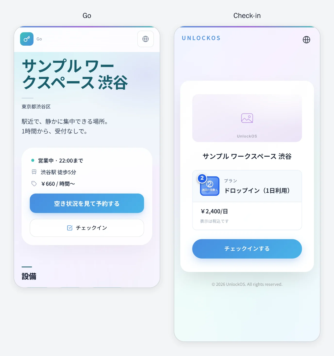
The screenshots below were taken in the real apps with sample photos. The coloured frames and numbers match the numbers in this table (the sample photos carry the same numbers).
| No. | Where in the admin console | Field | Count |
|---|---|---|---|
| ① | Basic Settings → "Facility Basic Settings" tab | Cover image | 1 |
| ② | Check-in List → open a check-in configuration | Facility Images | up to 10 |
| ③ | Booking Management → "Plan Settings" tab → open a booking configuration → each row of "Room Type × Plan" | Images | up to 5 |
| ④ | Option Products → open an option product | Image (optional) | 1 |
- ① is not applied until you press Save at the bottom of the page. ③ is applied when you save the booking configuration.
- The Option Products menu (④) appears only for facilities where the feature is enabled.
By app: what appears where
Go facility page (go.unlockos.io/{slug})
The public face of your facility. This is what people arriving from search or social media see first.
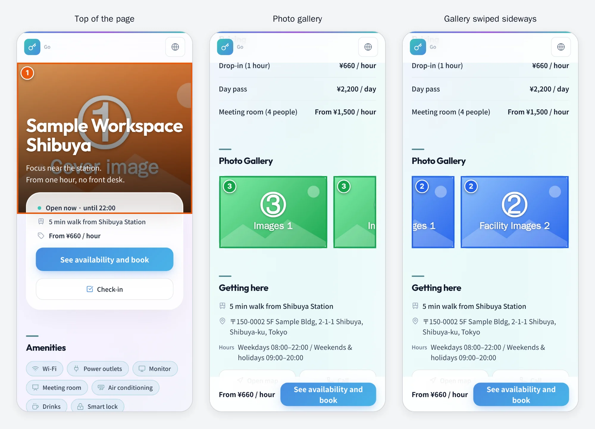
| Position | Photo | When not set |
|---|---|---|
| Hero banner at the top (full width) | ① Cover image | A pale band in the facility's colour with the facility name (shorter band) |
| Photo gallery (horizontal scroll) | Collected automatically from ③ Images, then ② Facility Images, then room-type images (up to 12) | Hidden when all are empty |
| Image shown when shared on social media | ① Cover image | A card without an image |
- The facility name, region and tagline (the "Tagline" field in Basic Settings) are overlaid in white, aligned left, and the booking panel covers the bottom edge of the banner. Keep important details out of the left half and the bottom edge of the photo.
- On a phone about one and a half photos are visible; guests swipe sideways to see the rest. ③ comes first, so ② photos appear after the ③ photos.
- The gallery has no Go-specific field. Photos in ③ and ② are shown as they are. The ① cover image and option product photos (④) are not included in the gallery.
- "Room-type images" have no field in the admin console; they exist only when support registered them, for example during onboarding. If a photo you do not recognise appears in the gallery or in "Spaces" in the booking app, it may be one of these, so contact support.
Booking app (booking.unlockos.io/{slug})
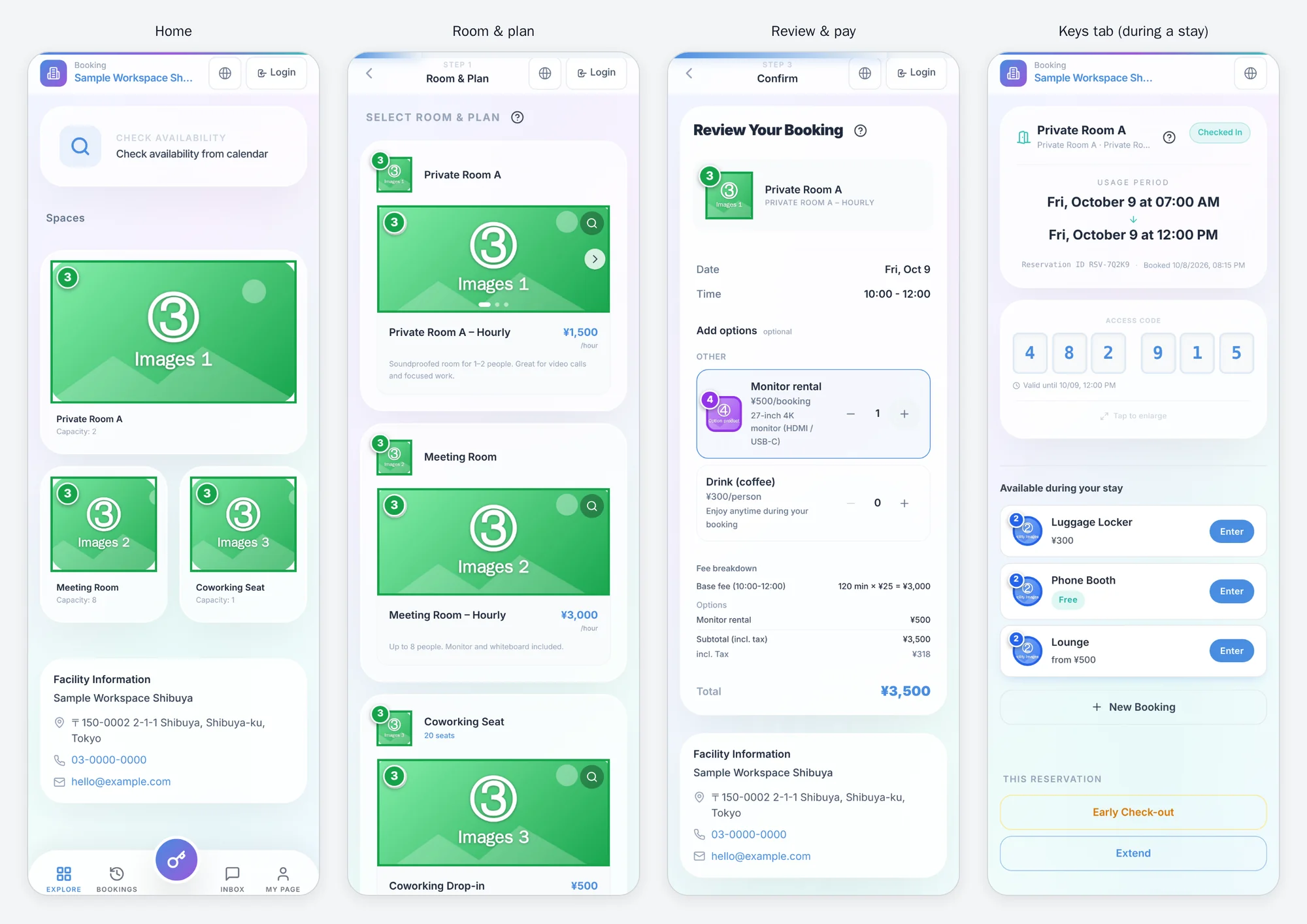
| Screen | Position | Photo | When not set |
|---|---|---|---|
| Home | Cards in "Spaces" (the first card is large) | First image of ③ (a room-type image takes priority if one exists) | A generated illustration |
| Room & plan | Small photo next to the room type name | First image of ③ | A generated illustration |
| Room & plan | Top of each plan card (slides when there are several; can be enlarged) | All of ③ | No photo area |
| Time selection (weekly grid) | Small photo of the chosen plan | First image of ③ | A generated illustration |
| Review & pay | Small photo in the booking summary | First image of ③ | A generated illustration |
| Review & pay | Small photo on each option row | ④ | A text-only row |
| Keys tab (during a stay) | Round icons in "Available during your stay" | First image of ② | First letter of the name |
- When a booking page is shared on social media, the image is ③ of the first plan that has a photo.
- If the same plan is assigned to several room types, the photos of the row that comes first in the order are used for every room. To show different photos per room, use separate plans.
Check-in app (checkin.unlockos.io/{slug})
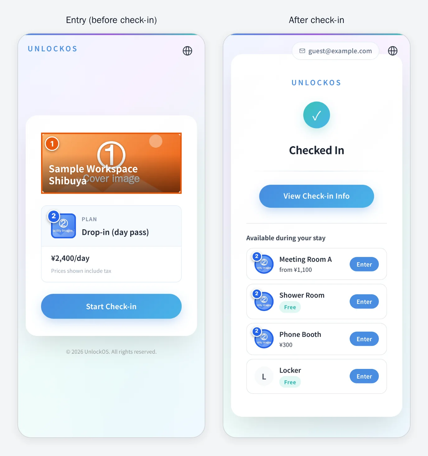
| Screen | Position | Photo | When not set |
|---|---|---|---|
| Entry (before check-in) | Band at the top of the card (facility name overlaid) | ① Cover image | A generated illustration plus the facility name |
| Entry (walk-in) | Small photo left of the plan name | First image of ② | Plan name only |
| After check-in, room key screen | Round icons in "Available during your stay" | First image of ② | First letter of the name |
- Only check-in configurations whose "Role of this configuration" is "Used during a stay (in-house service)" appear in "Available during your stay".
- Kiosk mode (
?kiosk=1) shows no photos.
Member app (member.unlockos.io/{slug})
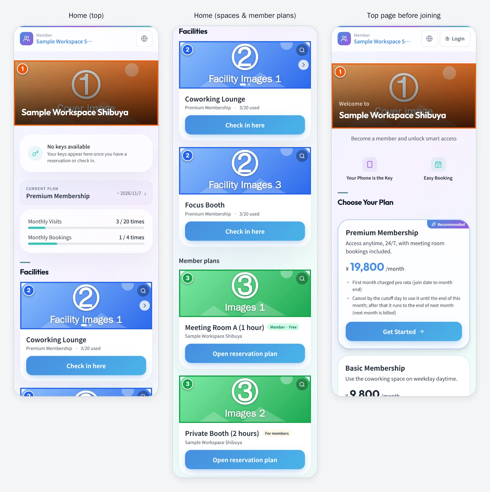
| Screen | Position | Photo | When not set |
|---|---|---|---|
| Home, top page before joining, sign-up | Large band at the top (facility name overlaid; "Welcome" too on the top page and sign-up) | ① Cover image | On Home, the first image of ③; if none, a colour band |
| Home | Top of the cards in "Spaces" (slides when there are two or more; can be enlarged) | All of ② | A generated illustration |
| Home | Top of the cards in "Member plans" and "Other booking plans" | First image of ③ (does not slide) | ① → a generated illustration |
- Membership plan cards do not show photos.
Other apps
Locker, parcel delivery (residents), FrontDesk and the embedded widgets do not show photos set in the admin console. The one exception: when the facility is known but the page cannot be found, the error screen shows the ① cover image at the top (the same is true for Booking, Go, Check-in and Member).
Reverse lookup: where does this photo appear?
| Photo | Go facility page | Booking | Check-in | Member |
|---|---|---|---|---|
| ① Cover image | Hero banner, social image | Error screen only | Band on the entry card | Band on Home / top page |
| ② Facility Images | Gallery | Icons for services during a stay | Plan photo, icons for services during a stay | Cards in "Spaces" |
| ③ Images (Room Type × Plan) | Gallery | Spaces, plans, review screen, social image | — | Plan cards, fallback for the band |
| ④ Option product image | — | Options on the review screen | — | — |
When no cover image is set
Go shows a pale band in the facility's colour, and Check-in shows a generated illustration. The first impression of the page changes a lot compared with a real photo.
Tips for preparing photos
- Landscape (16:9) photos fit every slot best.
- On upload, photos are shrunk automatically to fit within 800 × 450 px and compressed to 1 MB or less. You can pick a large photo as it is.
- Every slot fills its frame and crops the photo. The frame shape differs by position (a wide band, 3:2 tiles, squares, circles), so put the subject in the centre and it will read wherever it is cropped.
- In Go, Check-in and Member, the ① cover image has white text over a dark shade. Bright photos without busy detail work best.
- The first image of ② is also used as a round icon. Put a photo that still reads when small (an entrance, a close-up of equipment) first.
- Supported formats: JPG / PNG / WebP.
FAQ
No photo shows on the Go page
The hero banner is the ① cover image. Add it under Basic Settings → "Facility Basic Settings" tab → "Cover image" and press Save. The photo gallery appears when either ③ Images or ② Facility Images has a photo.
Photos I added for the member app also show on Go
② Facility Images and ③ Images are also used in the Go photo gallery. Go is a public page anyone can see, so do not add photos meant only for members.
I want different photos for each room
③ Images can be set per "Room Type × Plan" row, but when one plan is assigned to several room types, the photos of the row that comes first are used. Use a separate plan for each room.
Related Help
- Basic Settings - Cover image and tagline
- Check-in Configuration - Facility Images
- Booking Management Dashboard - Plan Settings (Room Type × Plan)
- Option Products - Option product image
- Go Portal
- Member App Home